Luxury Beauty Collections and the Importance of Colour Branding
Luxury brands are following the trend of owning colours and shades to further enhance their visual identity to make the brand synonymous with the brand.
Pantone 1837. Pantone 186C. Pantone 1448. These labels may seem unfamiliar, but you’ll be surprised to find out you’re actually more acquainted with the colours these numbers represent than you realise — that’s because they’ve been patented by some of the fashion industry’s biggest brands. Think Tiffany’s iconic blue shade (Pantone 1837), Valentino’s classic crimson (Pantone 186C) and Hermès’ luxurious orange (Pantone
For years, many of the world’s greatest luxury brands have each embraced a particular shade as a signature colour code. This hue is not only recurrently expressed throughout their runway shows but through every aspect of their brand’s visual identity. It increases brand recognition by 80 per cent and has the unique ability to communicate a feeling immediately. Whether it’s to signify elegance or preserve its history and heritage, it’s not difficult to see why brand’s choose to stick to one shade to help define themselves.
Especially in a time when digital media is on the rise, companies have more opportunities to get its signature colours in front of consumers and build the psychological bridge between hue and brand quicker than before.
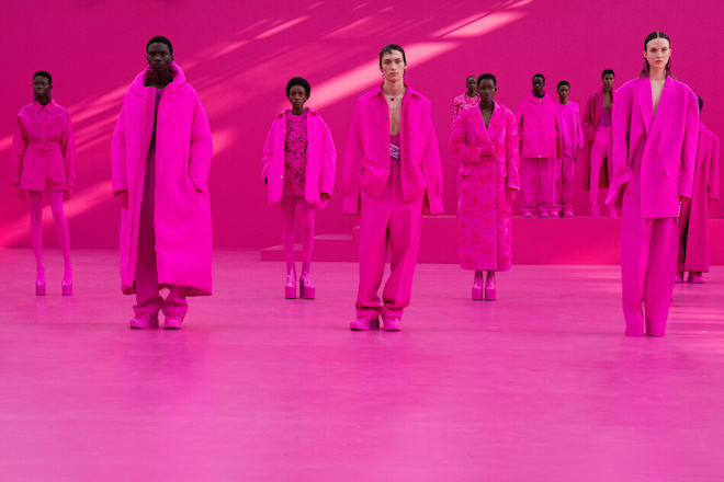
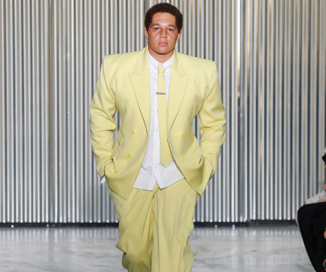
When Valentino’s creative director, Pierpaolo Piccioli turned Le Carreau du Temple into a pink-scape during for its Fall Winter 2022 collection, the future of colour and fashion was inevitably changed and heightened. What stood out wasn’t the extreme colour-blocking evident in the show, but the collaboration with Pantone that caused a stir. For years, Pantone has collaborated with some of the world’s most recognisable fashion brands in using colours as its visual adjectives to communicate its brand ethos. The shade, dubbed “Valentino Pink PP”, was developed by Piccioli, his design team and colour specialists at Pantone. Valentino described the pink-out as “an experimental yet deeply human gesture that enhances individuality, capturing values and feelings” and accentuated the trend of fashion brands claiming specific colours to communicate who they are and what they stand for.
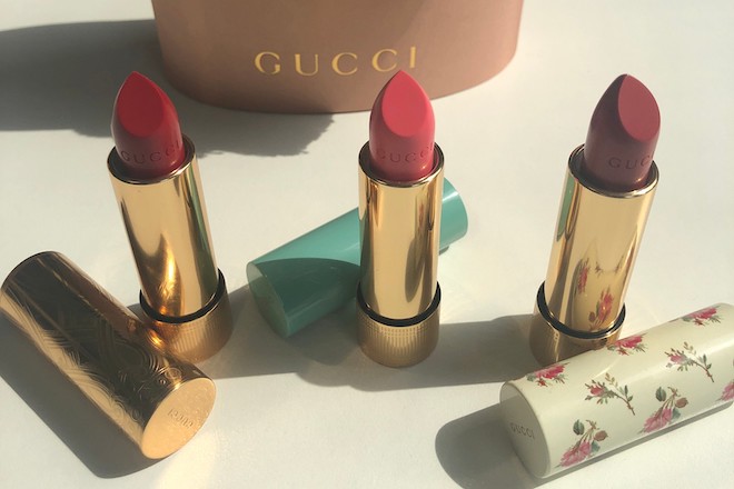
As brands diversify and branch out into other sectors and industries, some of the world’s most directional and well-loved, fashion-first luxury companies have been making bold moves into beauty. From Gucci’s “Gucci Beauty Rouge à Lèvres Satin lipstick collection” to Tom Ford’s latest “Bitter Peach” makeup collection inspired by the same peacy hue as its signature eponymous fragrance, the pivot into designer beauty is at an all-time high. It’s become part of the bigger picture when it comes to fashion, individuality and artistic expression, and over time, has become an extension of the fashion house’s identity.
- READ MORE: The Best Of Chanel Beauty
When claimed by fashion companies, colours play an important role in acting as a visual shorthand for a brand that can easily be spotted from a distance. It powerfully communicates the brand’s visual identity and heritage — appearing in everything from their packaging to interior design, but regardless of how common it is to be used in a brand, it’s seen to be absent in one category: the beauty collection.
The shades synonymous with a fashion house present a unique opportunity to experiment and incorporate the colour into newly launched beauty products. It makes for a powerful branding tool and feels like a natural progression for the house. There are only a handful of fashion brands who take advantage of this strategy.
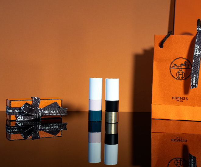
For example, Hermès does this beautifully with its cosmetics line. Its iconic Rouge Hermès and nail varnish collection offer a shade in the brand’s signature colour; known simply as Hermès’ Orange Boîte, the colour has become a symbol of luxury and ultimate refinement for the house. Applying it to beauty products allows Hermès-lovers to fully immerse themselves in the brand and create a stronger sense of unity and harmony across all aspects of the house.
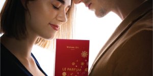
Similarly, Valentino’s signature crimson has been embedded in their beauty products. Red has been a signature for the label since Italian couturier Valentino Garavani set out on his own in 1959, with iconic appearances in runway shows and an illustrious history behind the shade, the colour is filled with heritage, symbolism and perfectly encapsulates the house’s DNA. Sensual, elegant and powerful, Valentino’s red embodies the type of women that wear the fashion brand’s pieces. By incorporating them into their beauty products, customers can now fully radiate what it means to be a Valentino woman.
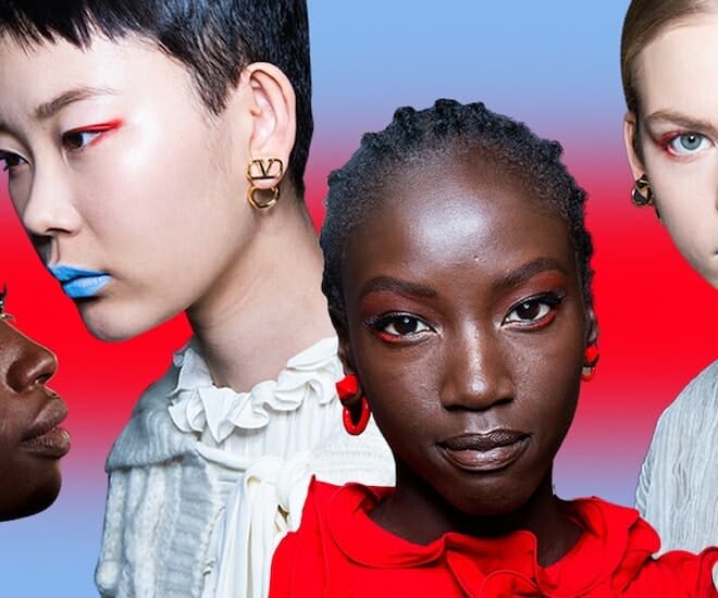
Besides existing in beauty products, signature colours are also present on the runway in the form of makeup looks worn by models. For Valentino’s pre-fall 2019 runway, models can be seen wearing the brand’s signature red to highlight the eyes — bold eyeliner and shadow frame their corners and cheeks, perfectly complimenting the red dresses and theme of the show — elevating the look and conveying the designer’s vision. They continue the trend of incorporating their iconic shade in runway looks with their most recent pink show — unveiled by creative director Pierpaolo Piccioli. It serves as a reminder of the importance of contemplation, and the profound impact that colour can have on the senses.
“Fashion has a great communication power, but this power is strongly linked to contemporaneity. To be relevant, you should be aware of and witness the world around you. Evolution is a fundamental part of what I like about fashion so to re-signify is a natural attitude to the future. Re-signify means to look at what you know through a new lens. Inspiration needs to be directed and worked with a different approach.” said Pierpaolo Piccioli. “Colour is transformative. Used in the right way, it is the essential tool for not only representing Valentino’s persona but is integral in connecting to human emotions and experiences.”
For more beauty reads, click here.